Effective color grading the raw film shots is not a easy task.
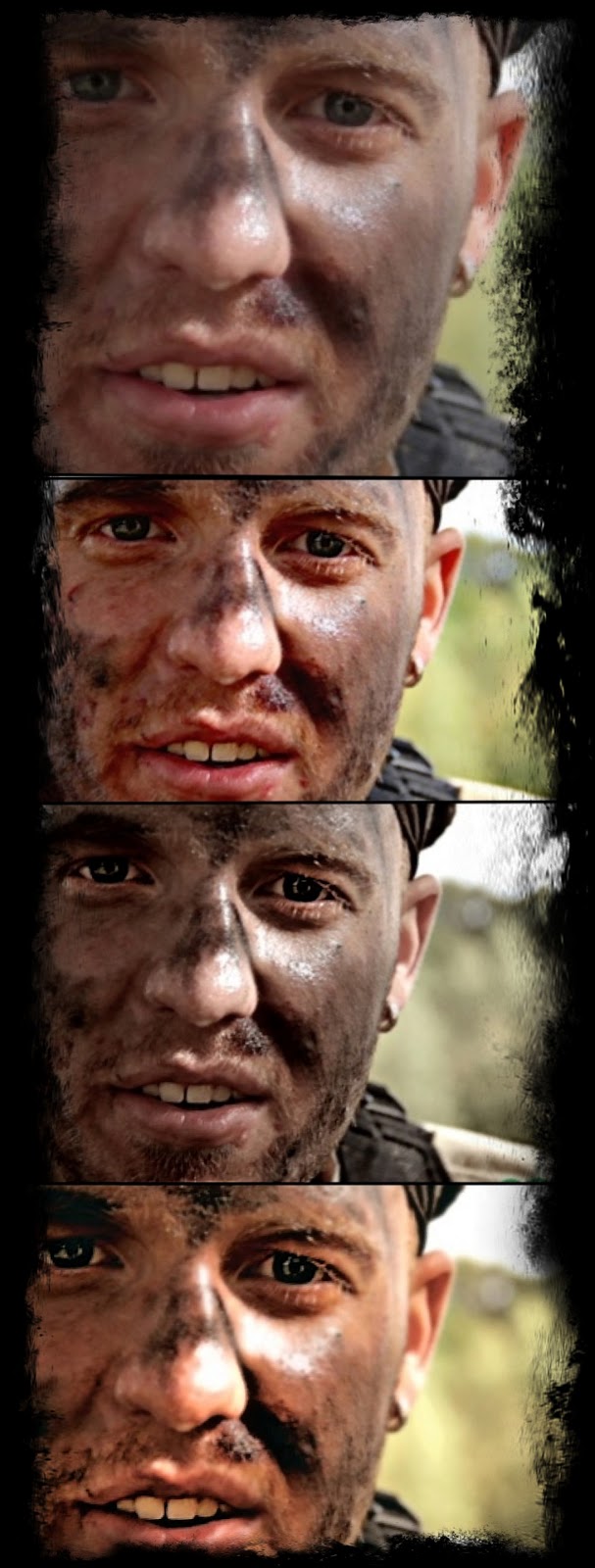
For instance take a look at these 4 images. The first one is the raw fotage (unedited). Which looks best? And consider that what looks best is not always what is perfect for the movie.
Here we went with nr 3. the gray tones give a better post apocalyptic / war feeling.
Color grading is a very finite art form, you can't always go with what looks best. We could pic color grading 2, or 4. Which have more good looking colors and contrast. But this isn't supposed to look warm and good looking. We wanted to get that feeling of war, cold, terror, emotionless. Something that works with the story.
You can compare the color grading with the music, again, we didn't make pop music that you can dance to, we made the kind of music that would make you want to slit your wrists.
Same theory for color grading. Whats best for the movie, is simply the image that fits the story.
Color grading in this movie was also made to correct moment to moment transitions. Sometimes we used more cool color tones, to symbolize fear. And sometime we would use color grading, when we shot different shots of the same scene, in order to make them fit together, the color grading fine tuned both shots to make them look alike.
This process of color grading is very time demanding, and also frankly speaking, quite frustrating, because you never know if you have picked the right color grading until you see the final scene.